UI
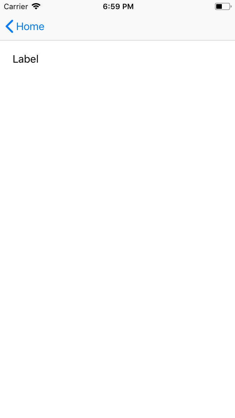
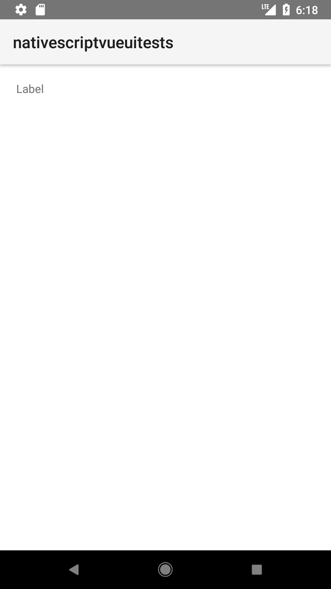
Label
<Label> is a UI component that displays read-only text.
🟠 Note
This <Label> is not the same as the HTML <Label>.


Simple label
<Label text="Label" />
Styling the label
If you need to style parts of the text, you can use a combination of a FormattedString and Span elements.
<Label textWrap="true">
  <FormattedString>
    <Span text="This text has a " />
    <Span text="red " style="color: red" />
    <Span text="piece of text. " />
    <Span text="Also, this bit is italic, " fontStyle="italic" />
    <Span text="and this bit is bold." fontWeight="bold" />
  </FormattedString>
</Label>
Props
letterSpacing
<Label text="Hello there!" letterSpacing="1"/>
Type: number
Gets or sets letter-spacing style property.
lineHeight
<Label text="Hello there!" lineHeight="10"/>
Type: number
Gets or sets line-height style property.
text
<Label text="Hello there!" />
Type: string Gets or sets the text displayed or to be displayed by the Label instance.
textAlignment
<Label text="Hello there!" textAlignment="center" />
Gets or sets text-alignment style property. Valid values: "initial" | "left" | "center" | "right". Defaults to "left"
textDecoration
<Label text="Hello there!" textDecoration="underline" />
Gets or sets text decoration style property. See TextDecorationType for valid values. Defaults to "none".
textTransform
<Label text="Hello there!" textTransform="capitalize"/>
Gets or sets text transform style property. See TextTransformType for valid values. Defaults to "initial".
textWrap
<Label text="In publishing and graphic design, Lorem ipsum is a placeholder text commonly used to demonstrate the visual form of a document or a typeface without relying on meaningful content. Lorem ipsum may be used as a placeholder before final copy is available." textWrap="true"/>
Gets or sets whether the text breaks and renders on the next line if the current runs out of space. Defaults to false.
whiteSpace
<Label text="In publishing and graphic design, Lorem ipsum is a placeholder text commonly used to demonstrate the visual form of a document or a typeface without relying on meaningful content. Lorem ipsum may be used as a placeholder before final copy is available." whiteSpace="normal"/>
Gets or sets the white space style. Valid values: "initial" | "normal" | "nowrap" Defaults to "initial".
...Inherited
For additional inherited properties, refer to the API Reference.
Event(s)
textChange
<Label text="{{ greeting }}" loaded="{{ onLabelLoaded }}"/>
onLabelLoaded(args: EventData) {
    const label = args.object as Label

    label.on("textChange", (textChangeEvent: PropertyChangeData)=>{

    console.log(textChangeEvent.eventName)
    })
}
Emitted when the label text is changed.
Native component
| Android | iOS |
|---|---|
android.widget.TextView | UILabel |
- Previous
- Image
- Next
- ListPicker


