Note: You are on the beta version of our docs. This is a work in progress and may contain broken links and pages.
UI
Switch
<Switch> is a UI component that lets users toggle between two states.
The default state is false or OFF.
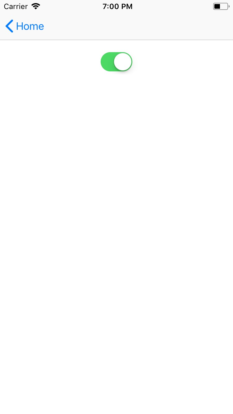
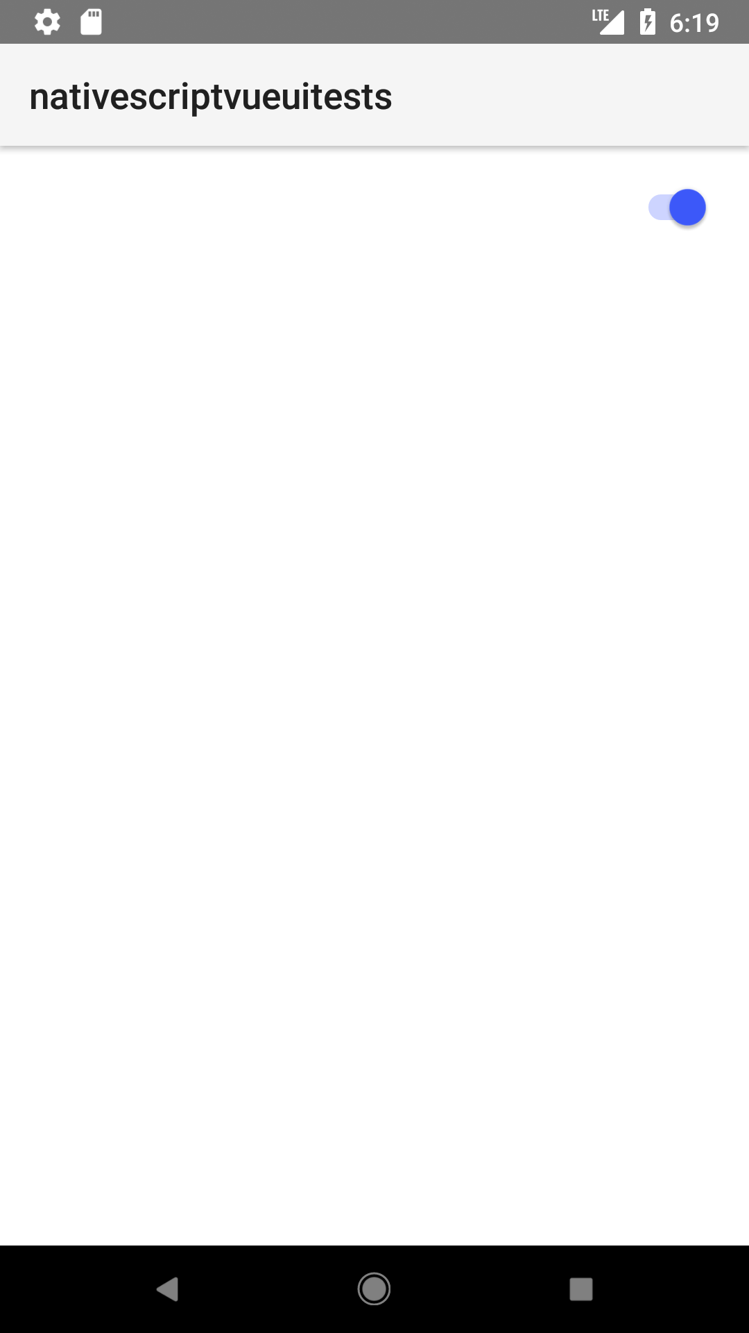
Simple Switch
To be notified when the Switch state changes, listen for the checkedChange event.
xml
<Switch checked="{{ checked }}" loaded="{{ onSwitchLoaded }}" />
ts
export class HelloWorldModel extends Observable {
  checked = true
  constructor() {
    super()
  }

  onSwitchLoaded(args: EventData) {
    const switchComponent = args.object as Switch

    switchComponent.on('checkedChange', (args: PropertyChangeData) => {
      console.log('checkedChange: ', args.value, 'Old: ' + args.oldValue)
    })
  }
}
Styling Switch
xml
<Switch checked="true" color="#BFCDAC" backgroundColor="green" offBackgroundColor="#DC493D"/>
Props
checked
xml
<Switch checked="true"/>
ts
switchComponent.checked = false
Gets or sets the state value of the switch.
offBackgroundColor
xml
<Switch offBackgroundColor="#DC493D"/>
Gets or sets the off-state color.
...Inherited
For additional inherited properties, refer to the API Reference.
Event(s)
checkedChange
ts
onSwitchLoaded(args: EventData){
    const switchComponent = args.object as Switch;

    switchComponent.on("checkedChange", (args: PropertyChangeData)=>{

    console.log("checkedChange: ", args.value, "Old: "+args.oldValue)

    })
}
Emitted when the switch state changes. See PropertyChangeData Interface for the event data.
Native component
| Android | iOS |
|---|---|
android.widget.Switch | UISwitch |


